Reverse Proxy Grapher
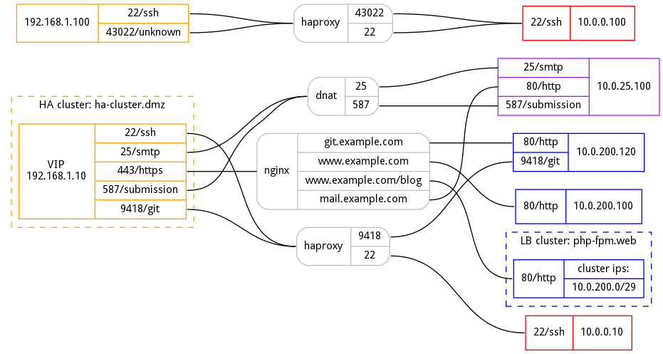
I am working on documentation for an upcoming security audit and needed a way to display how various externally available ports and URLs mapped to internal VMs, clusters, and services. I didn't want to draw them manually in various charting tools because this is the kind of data that quickly becomes obsolete as things are added and retired -- and manually rejigging things every time a node is added or deleted takes a lot of effort.
So, I wrote a small tool in python that uses graphviz to generate such graphs automatically. All it requires is a simple yaml file like this:
subnets:
  dmz:
    cidr: '192.168.1.0/24'
    color: 'orange'
  webapps:
    cidr: '10.0.200.0/24'
    color: 'blue'
  mailhosts:
    cidr: '10.0.25.0/24'
    color: 'purple'
  jumphosts:
    cidr: '10.0.0.0/24'
    color: 'red'

clusters:
  'php-fpm.web':
    ips:
      - '10.0.200.0/29'
  'ha-cluster.dmz':
    ips:
      - '192.168.1.11'
      - '192.168.1.12'
    vips:
      - '192.168.1.10'

proxies:
  192.168.1.10:
    22:
      haproxy: '10.0.0.10'
    25:
      dnat: '10.0.25.100'
    443:
      nginx:
        'www.example.com': '10.0.200.100:80'
        'www.example.com/blog': 'php-fpm.web:80'
        'git.example.com': '10.0.200.120:80'
        'mail.example.com': '10.0.25.100:80'
    587:
      dnat: '10.0.25.100'
    9418:
      haproxy: '10.0.200.120'
  192.168.1.100:
    22:
      haproxy: '10.0.0.100'
    43022:
      haproxy: '10.0.0.100:22'
Then it will generate a pretty graph like this:

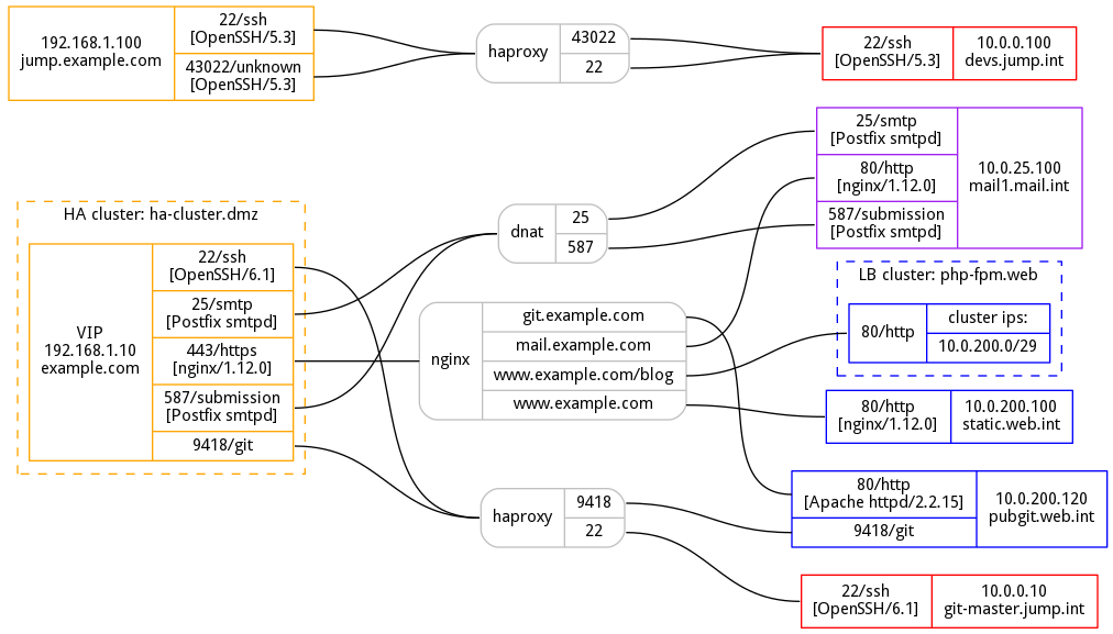
You can also plug the XML output of your nmap scans to add some more details to your graph, such as hostnames and product/version details identified by nmap:

There's still lots of missing functionality in the code -- for example, I've not tested how badly this would break with ipv6 at all, plus there's no way to specify multiple proxy levels. However, hopefully this should prove useful for simpler configurations and will help you impress your bosses. :)
You can find the project on github:
